

Home Library: Window Treatment Edition, Part 1
Getting Offline to Get Inspired

Textiles make the home. I’m biased because I went to college for Textiles, but they are my favorite interior element. They are the warmth, the color, the pattern, the texture. A window treatment is, for me, primarily a place to introduce a new textile and therefore should not be skipped. And yet, I have lived without curtains or shades of any kind in my Brooklyn studio for 4.5 years.
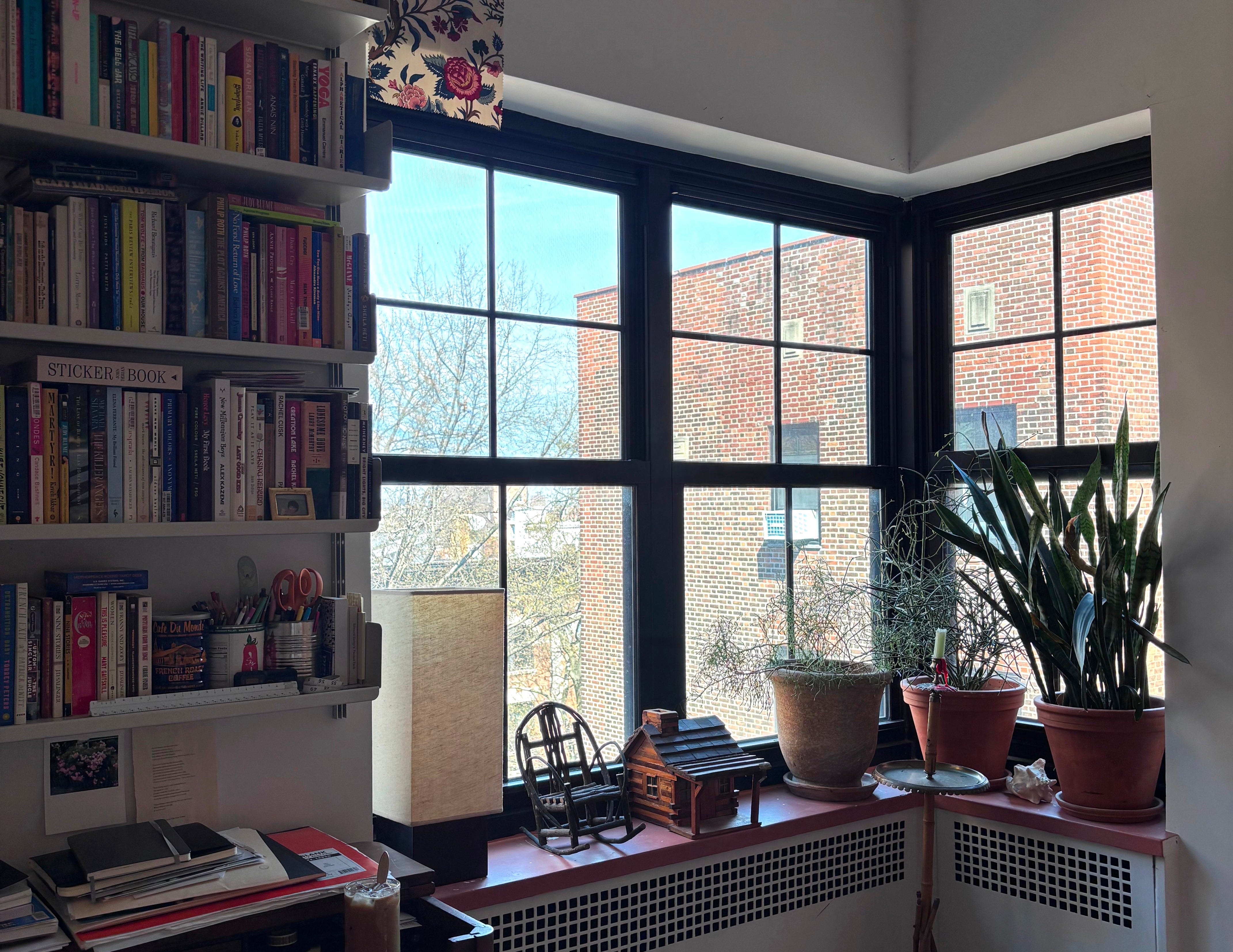
My dilemmas are thus: my apartment is north facing and therefore not the brightest, and so I don’t want to hinder the natural light. I also don’t care about blocking the light for sleep since I rise before the sun on most days and abhor “sleeping in”. (I abhor it for myself. You do what you want with your one wild and precious life.) Another issue is I use my windowsill for display of objet and the few plants that I can manage to keep alive, which protrude past the projection of the sill. I would likely never really close the curtains, but they would need to be operable because inoperable always-open curtains are not acceptable (more on this below). Lastly, and this is perhaps adjustable, but ideally not, is that I have wall mounted bookshelves 2.25” from the window edge, leaving me scant space for a proper stack.
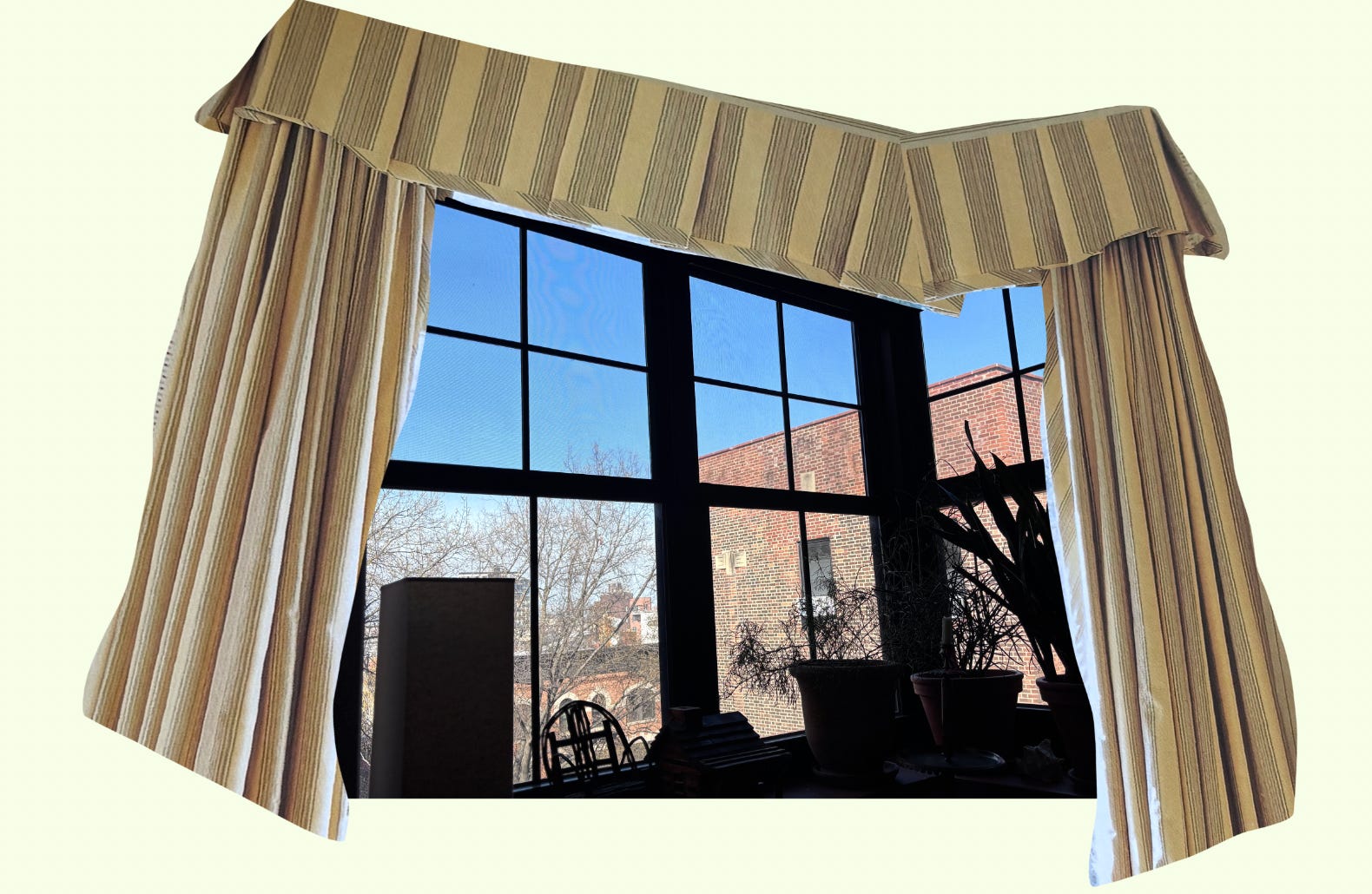
When it comes to WT (window treatments) I am decidedly trad at heart. I lived in a Colonial house built in 1771 growing up, and the curtains in the upstairs guest bedroom, which I do not have a photo of, but are prominent in my mind’s eye, were done in a large scale Chinoiserie print on cotton percale with a soft straight valance and were very subtly lined so the light shone through. This is my ideal, except I personally wouldn’t Chinoiserie in 2026. I prefer to appropriate from cowboy culture if I must (and am searching for a hint of cow print for something, somewhere…) For this application, however, I am currently obsessing over this Le Manach print. Le Manach is a French house under the Pierre Frey umbrella which was founded in the 19th century and isn’t not complicated by colonialist gaze (and more) upon Chinese and Indian cultures. This pattern is derivative of Indian palampore bed hanging textiles, but the ground cloth and printing technique are decidedly French. These uncomfortable mashups are aplenty in décor and that’s an essay for another time. As this Manach depicts only flowers I will allow it. Also, it’s drop.
It is so easy to look online for inspiration, but one does start to feel the feedback loop of the internet slop pile. I am trying to turn first to my library of design books and magazines I have amassed over the years in the hopes of finding a fresh perspective (and justifying future book purchases). Perhaps you can find some inspiration here too:
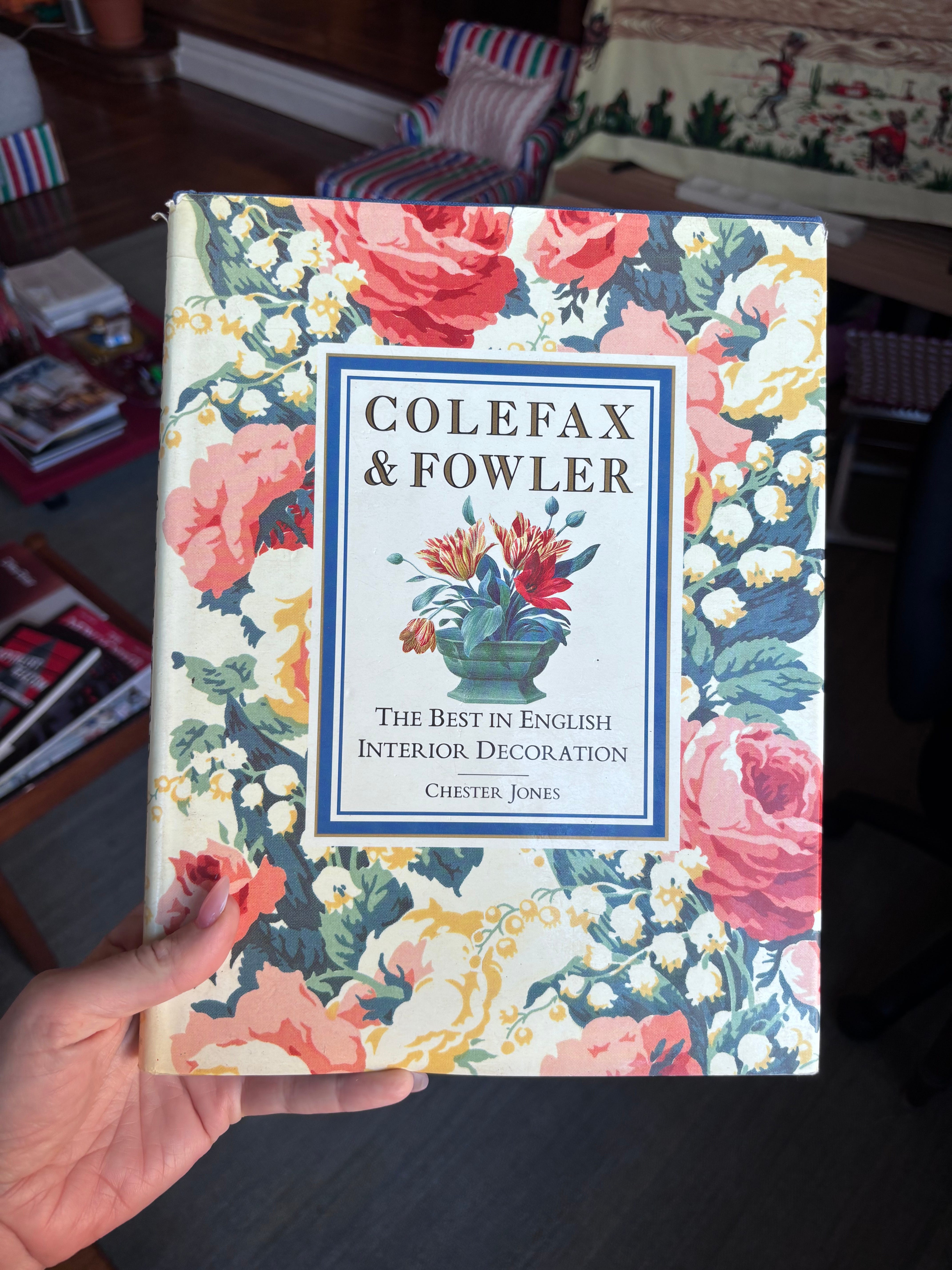
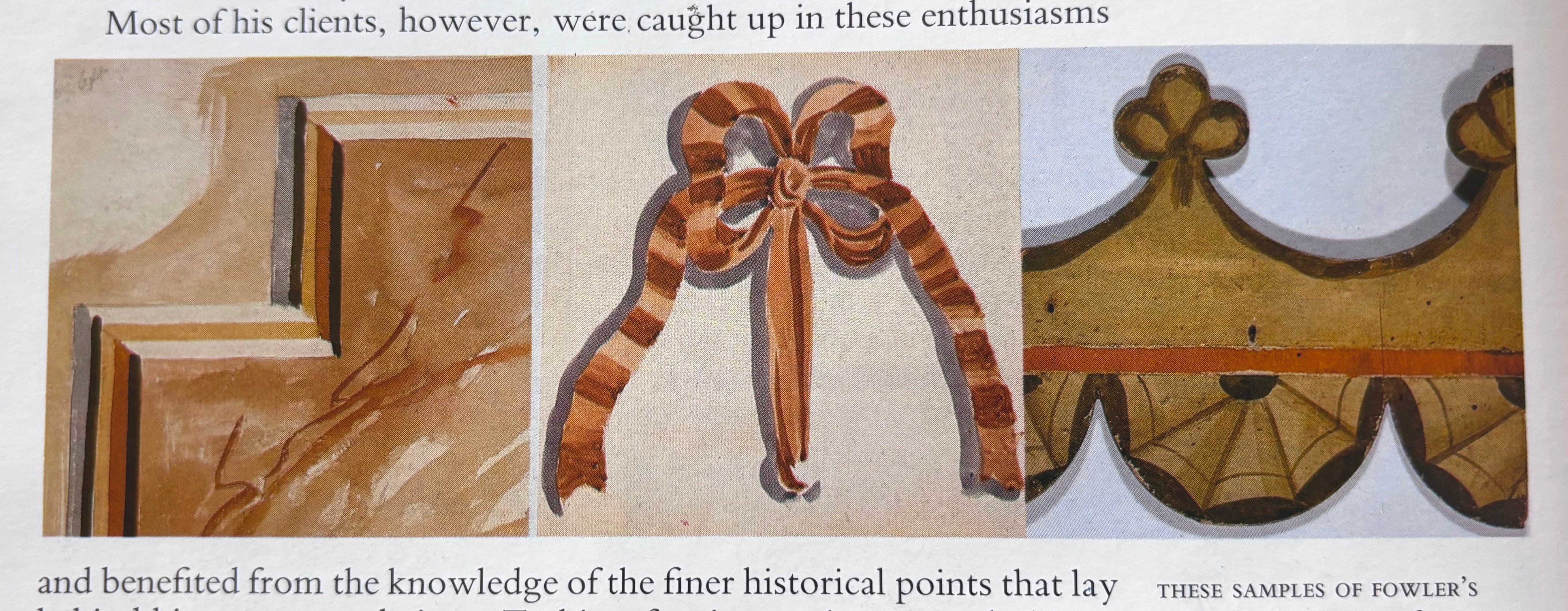
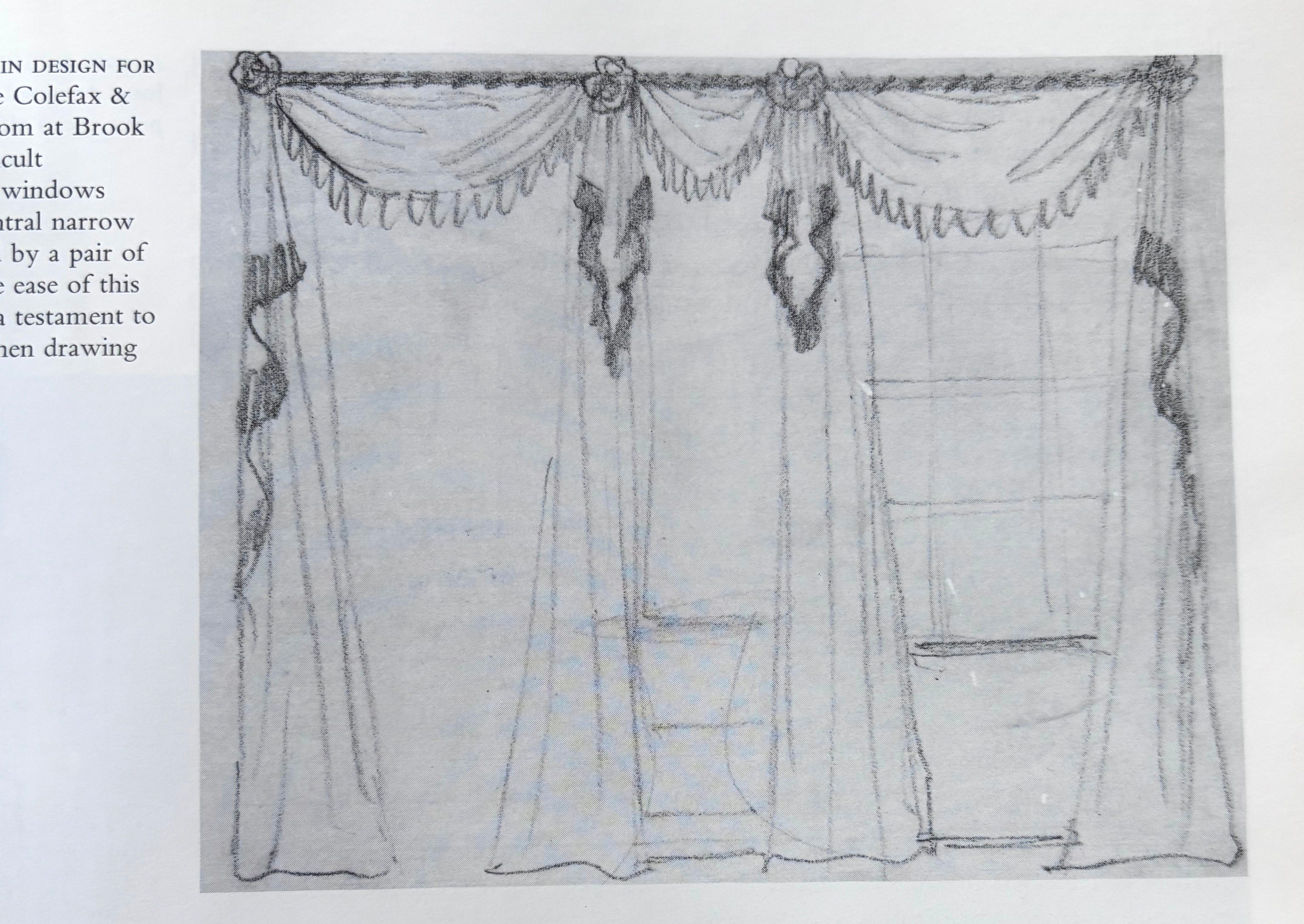
As I said, I love trad, so I came first to the vaunted British interior designers Sibyl Colefax and John Fowler who basically invented English country style. (Buy the book here.) Prints on prints on chintz etc. and some seriously fanciful curtains. I know this is likely not where I will find my personal precedent but I like to start at the beginning, and it is great inspiration for fabrics. The book is filled with lovely hand-drawn details done by Fowler:
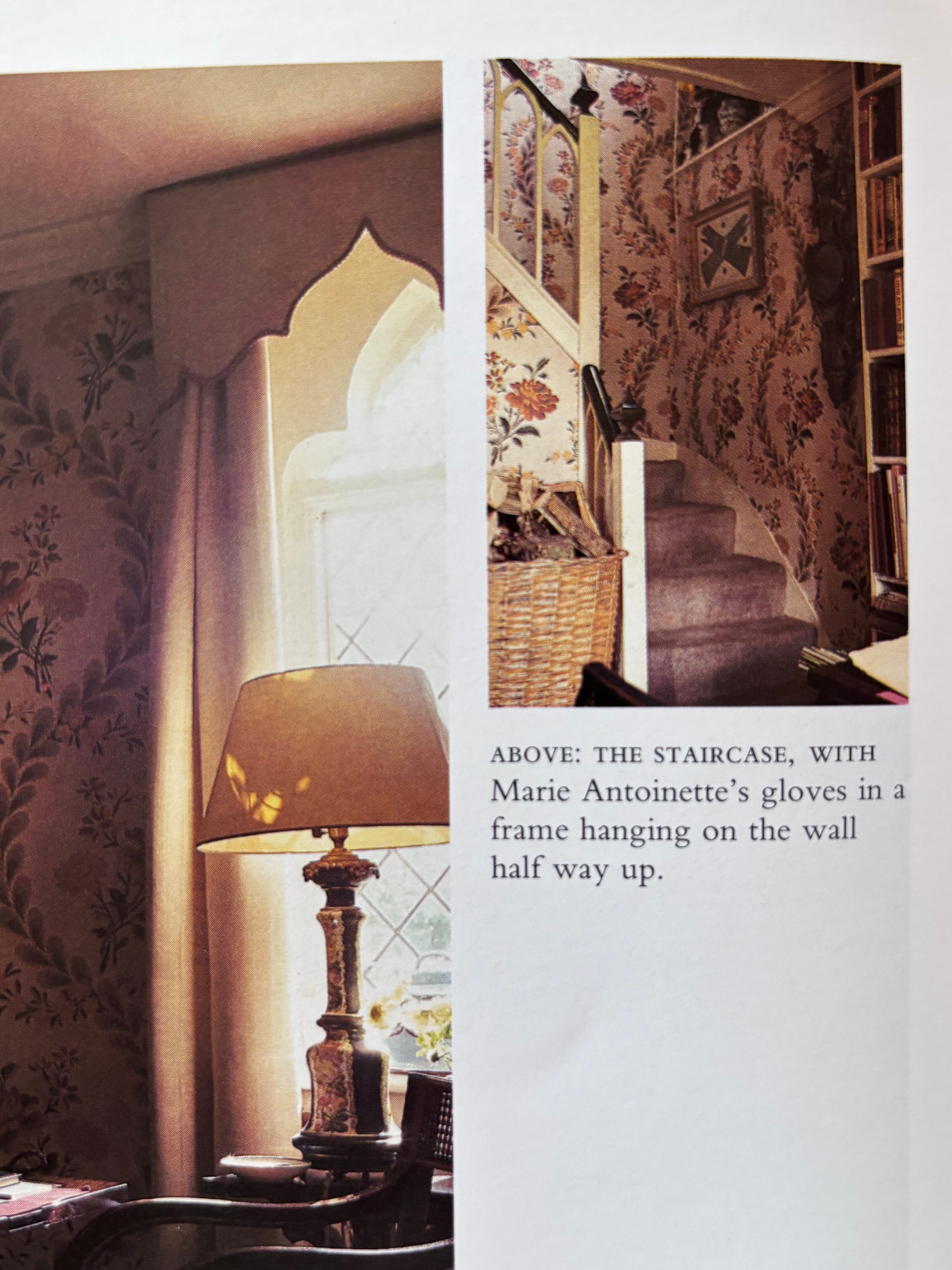
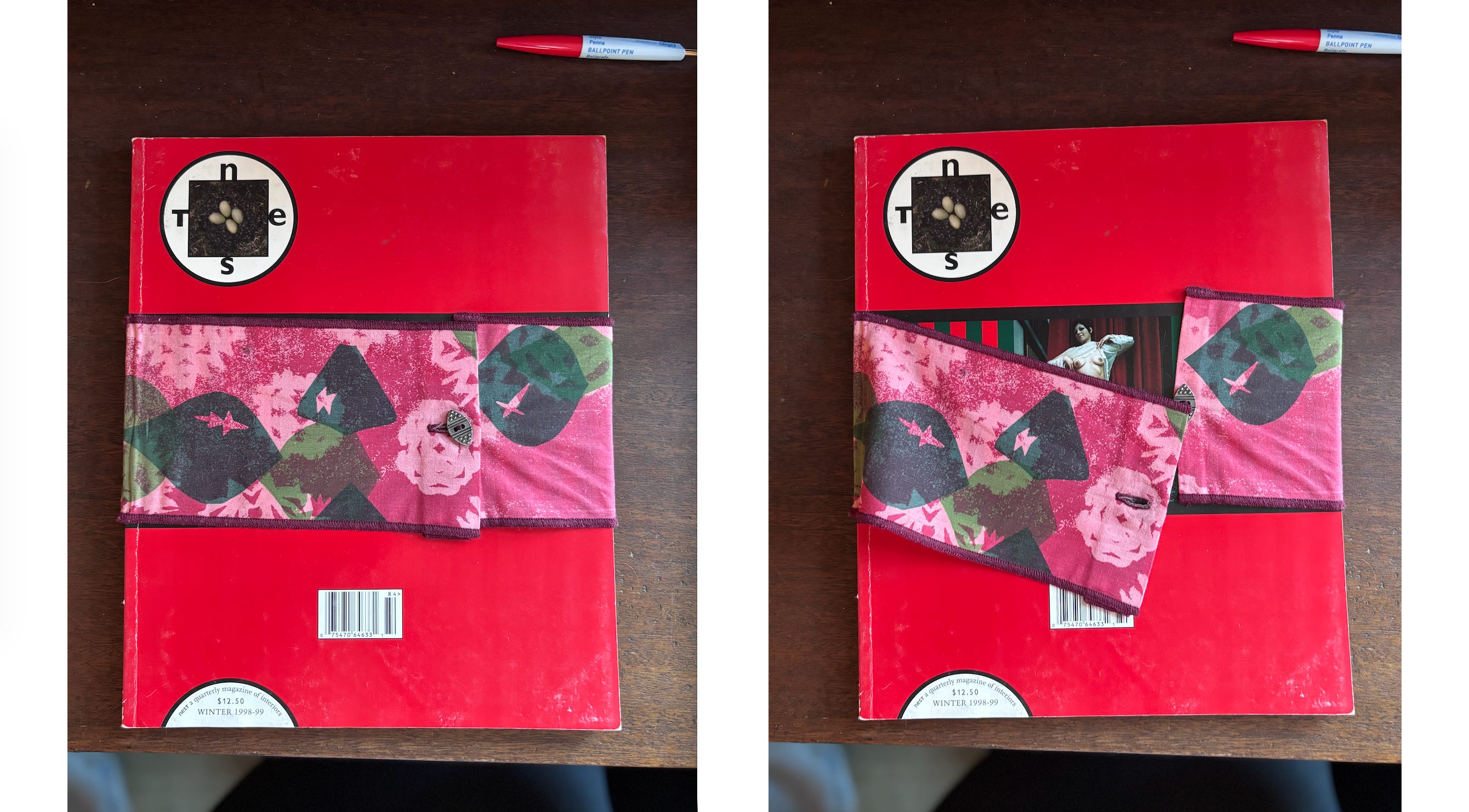
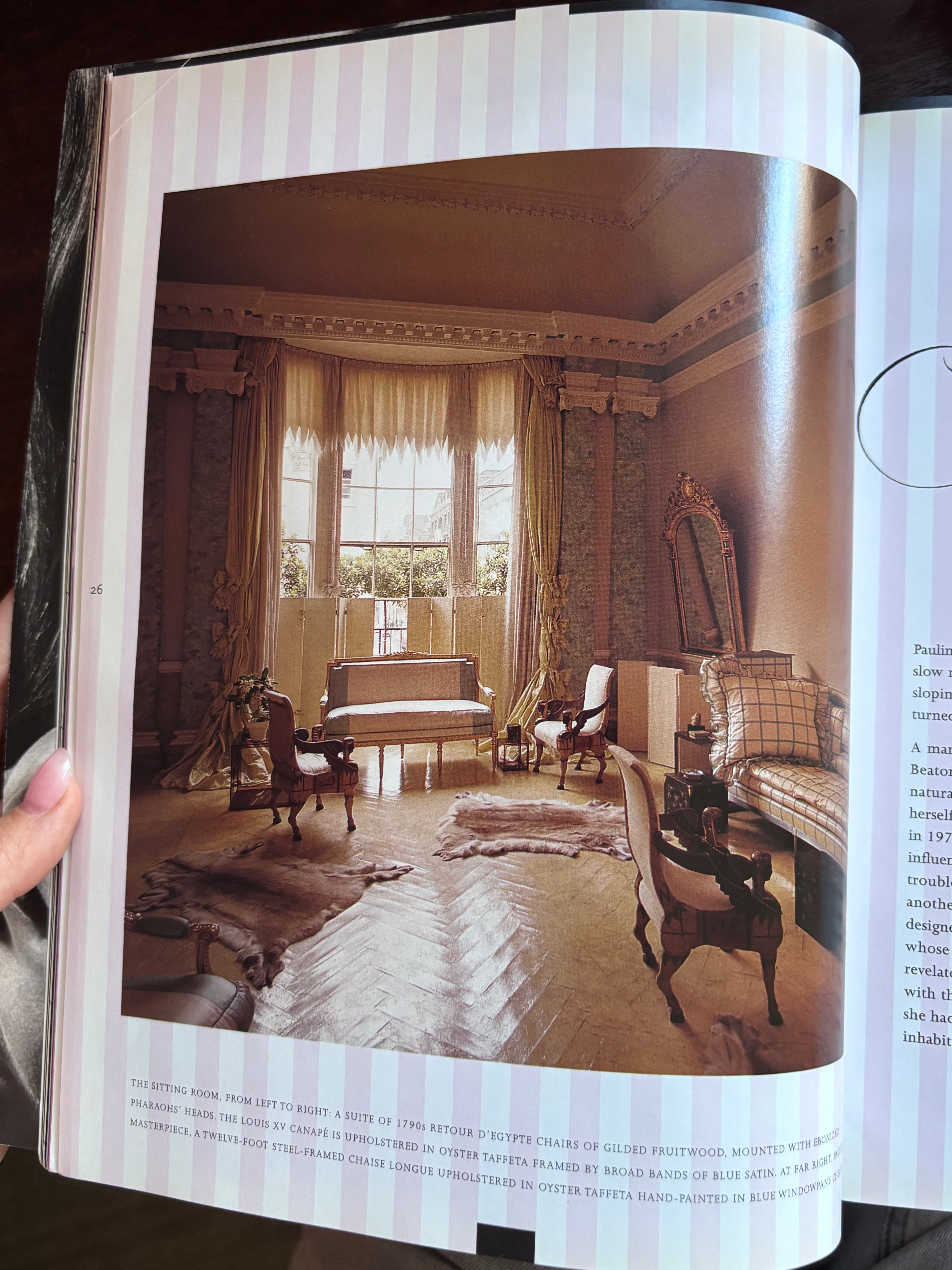
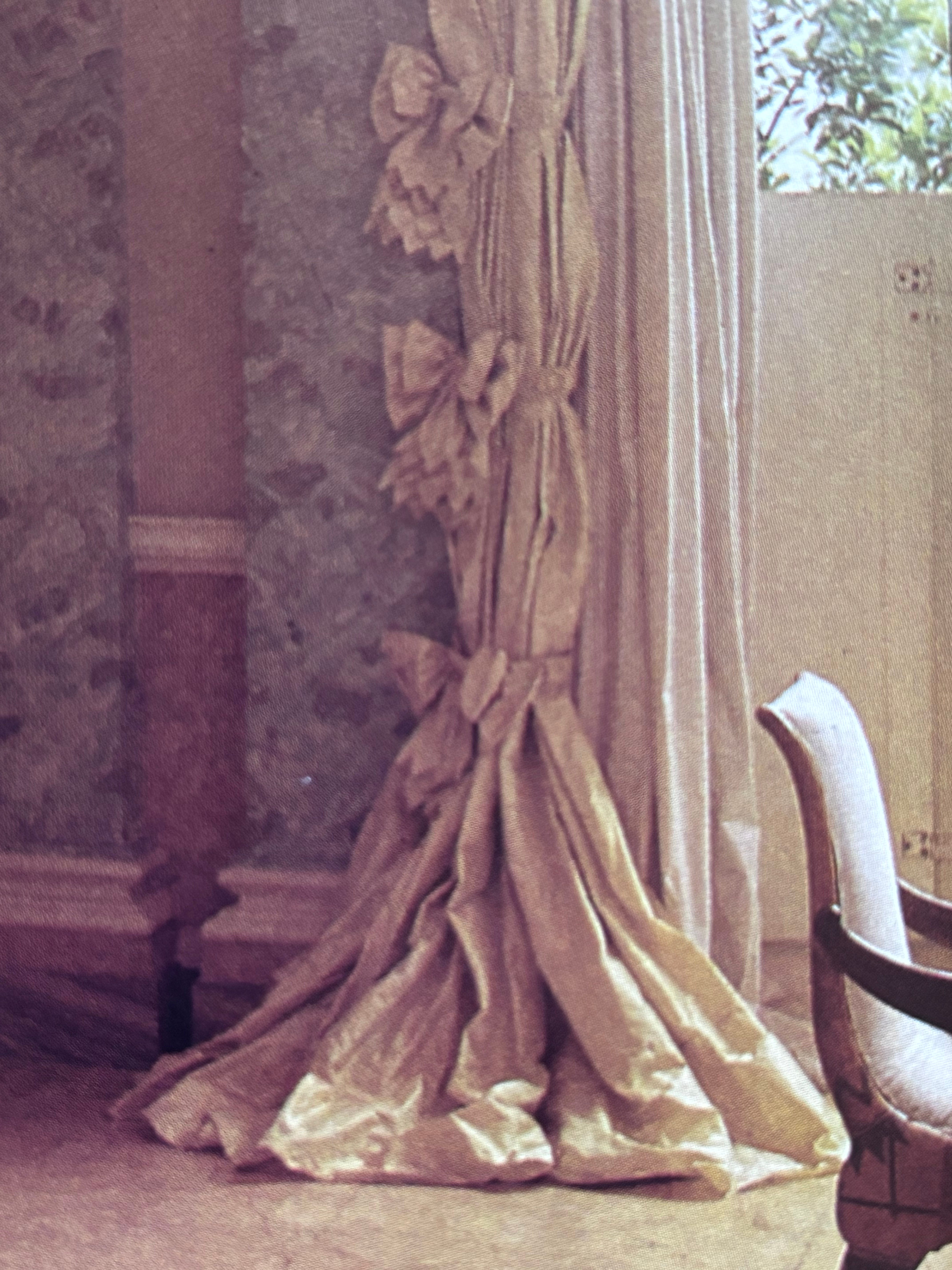
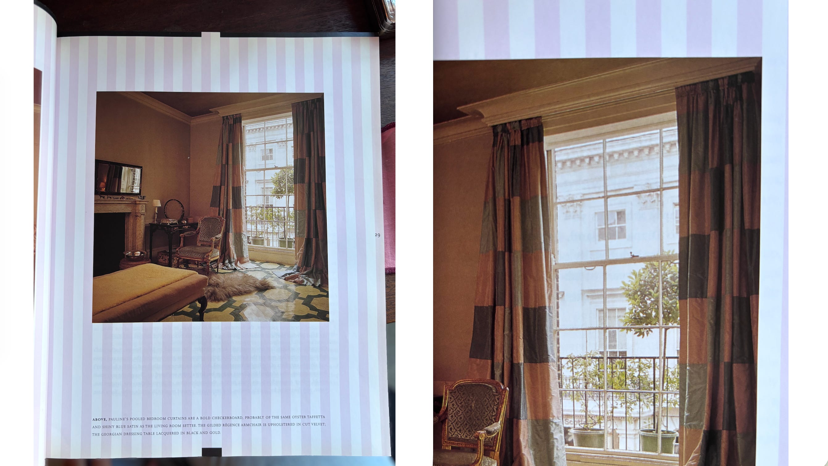
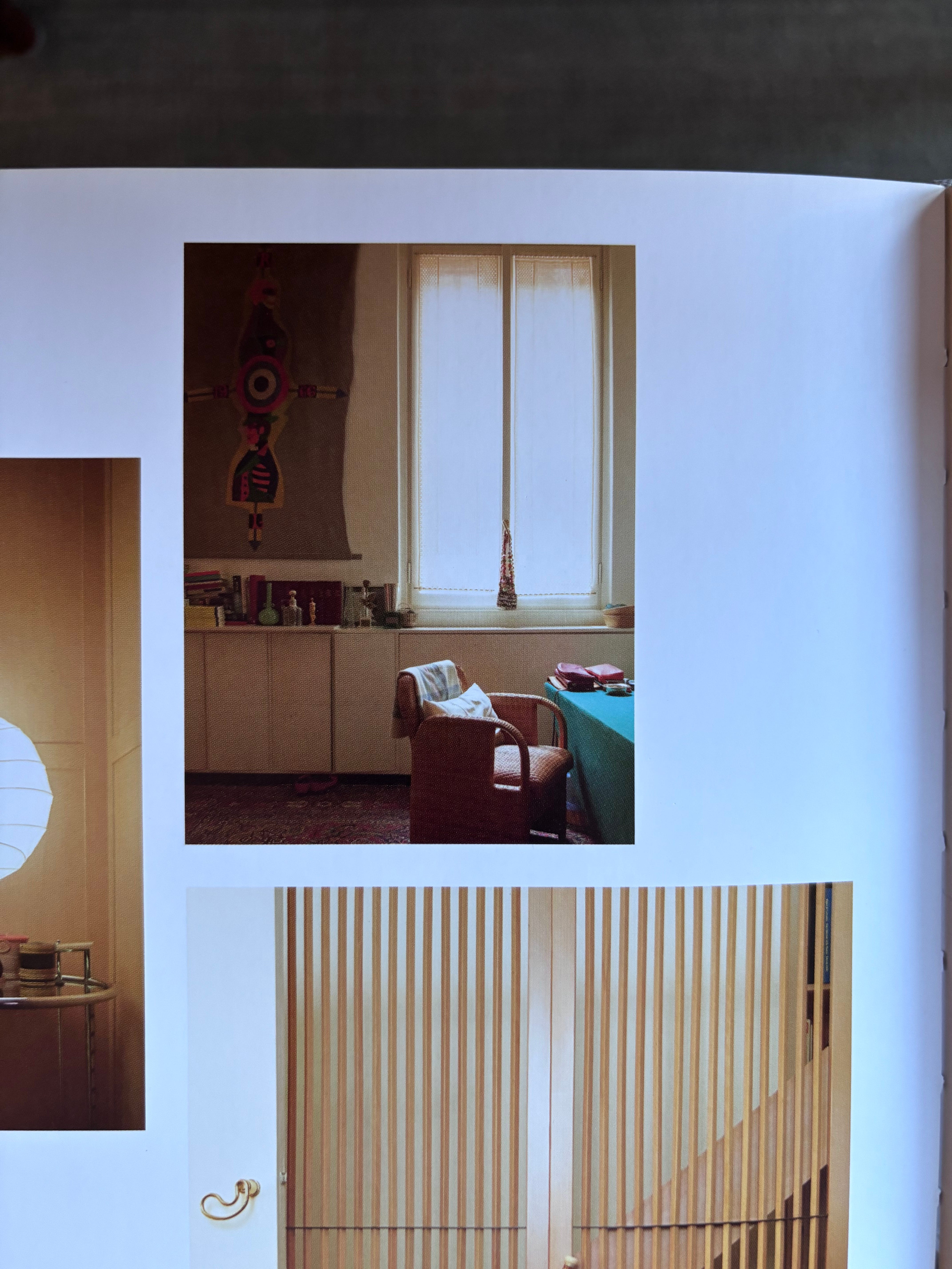
Rummaging through my Nest Magazines, I found a John Fowler project in the Winter 1998-99 issue. (High Valley Books is a great resource for old magazines. I think I’ve bough half my Nests there and many old WOIs. They also had a stack of Nests at Casa Magazines recently, and you can always be on the lookout for the telltale yellow spines at heady design shops and used bookstores everywhere in coastal locales. Not to be confused with The National Geographic, Nest kept the issues irregularly shaped for your spotting convenience.) The client was the eccentric Pauline de Rothschild, who by all accounts was a strange and ethereally-opinionated client who brought about great stress and great work from Fowler. It’s worth getting your hands on a copy of the issue to read the whole thing.
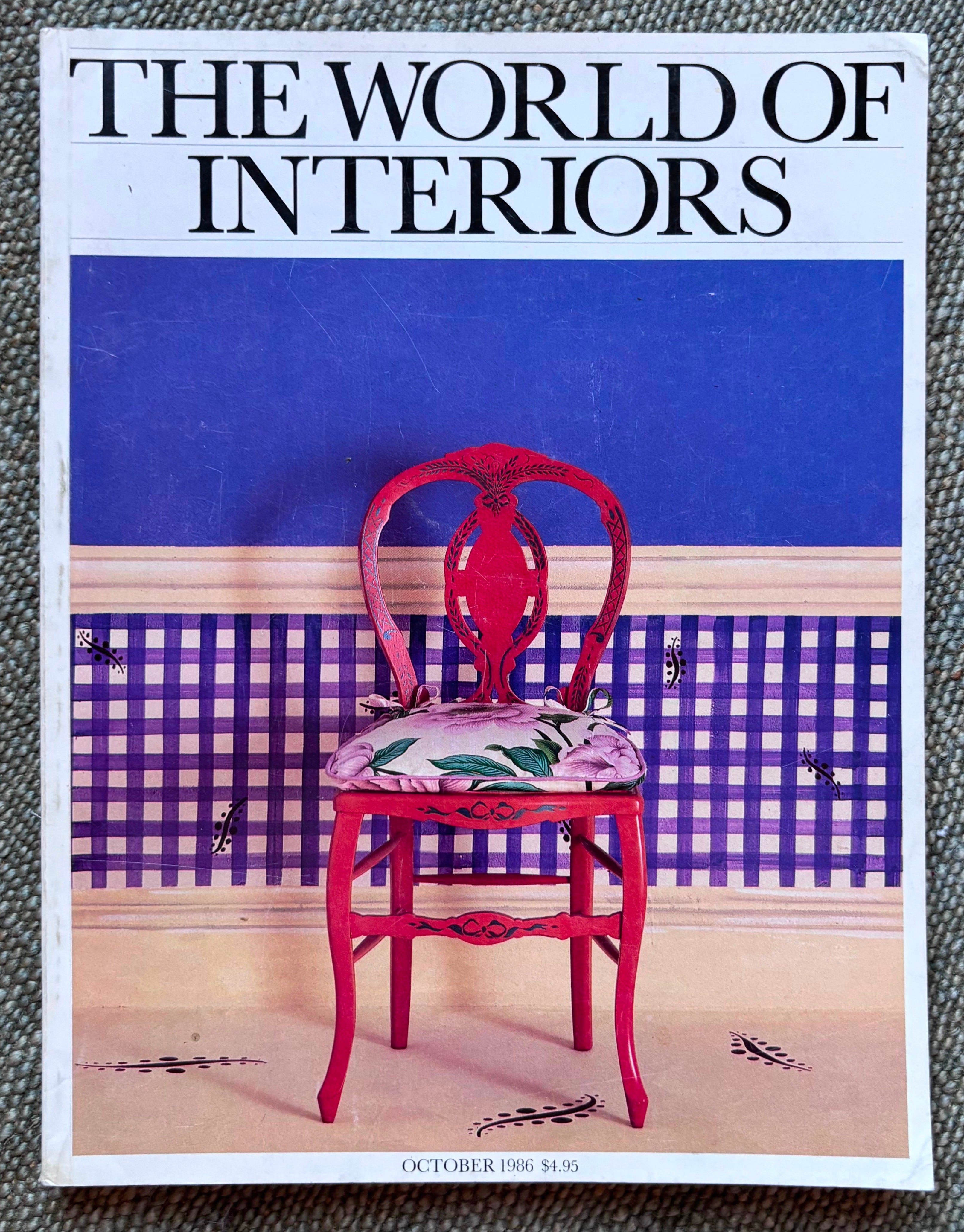
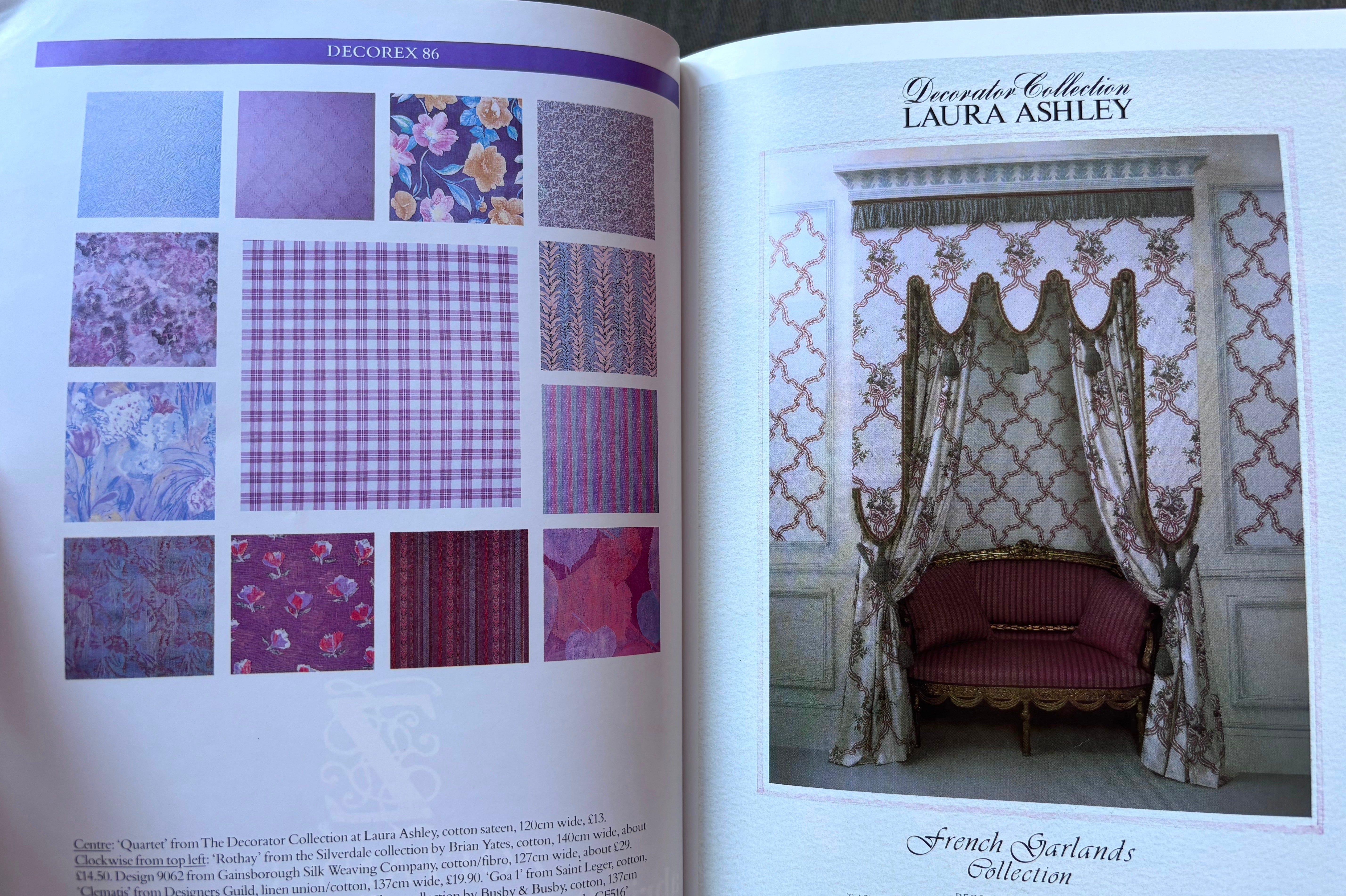
While I was on this kick I figured I’d peek through a 1980-something The World of Interiors. The Decorex pages found in this era of WOI can’t be beat for their palette-specific pattern mixing, although somewhat less artful than today’s crafty little dioramas, they were perhaps more helpful to the decorator. Ultimately this issue proved less helpful in finding inspiration for myself and more interesting as a time capsule of a time I’m glad I was born after.
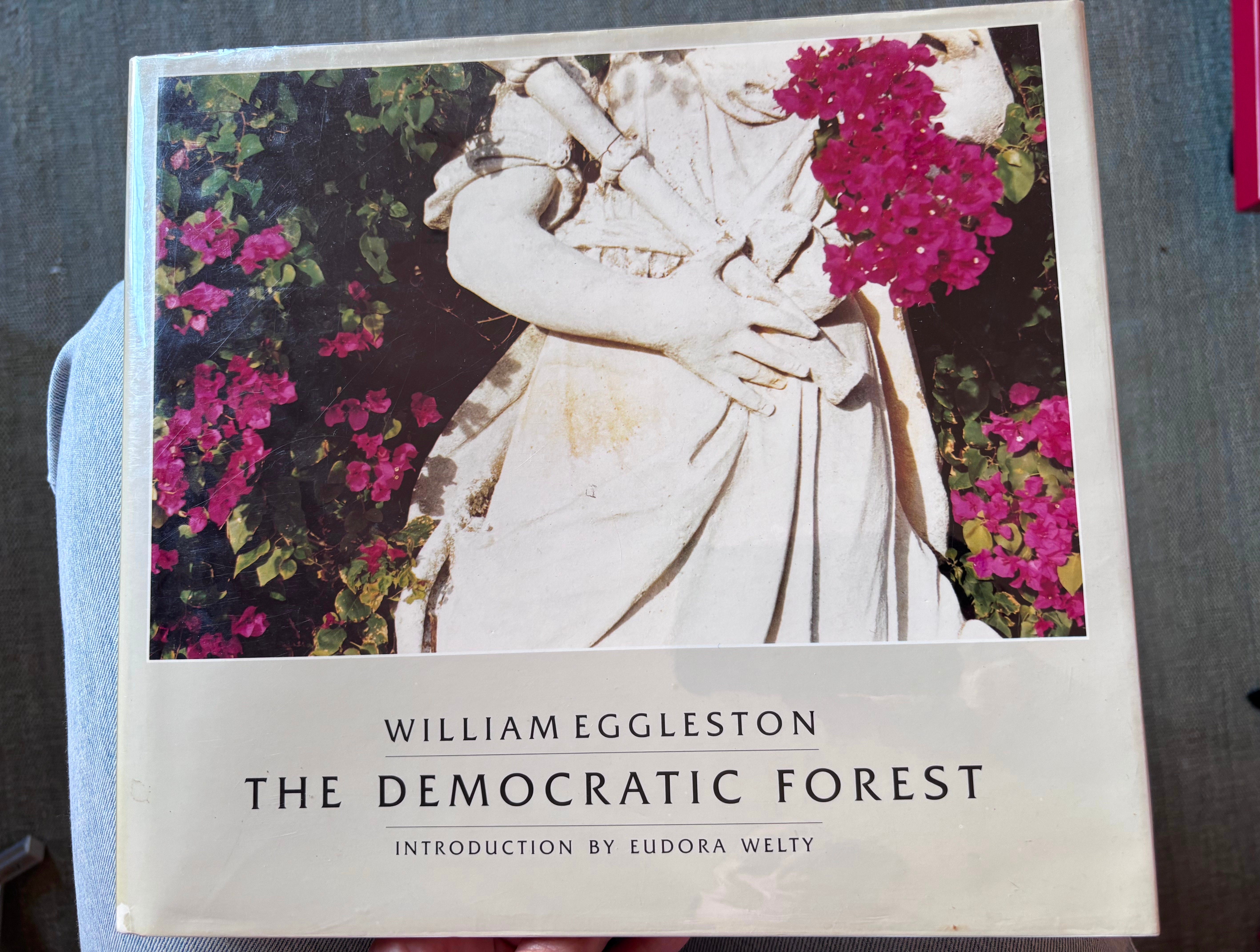
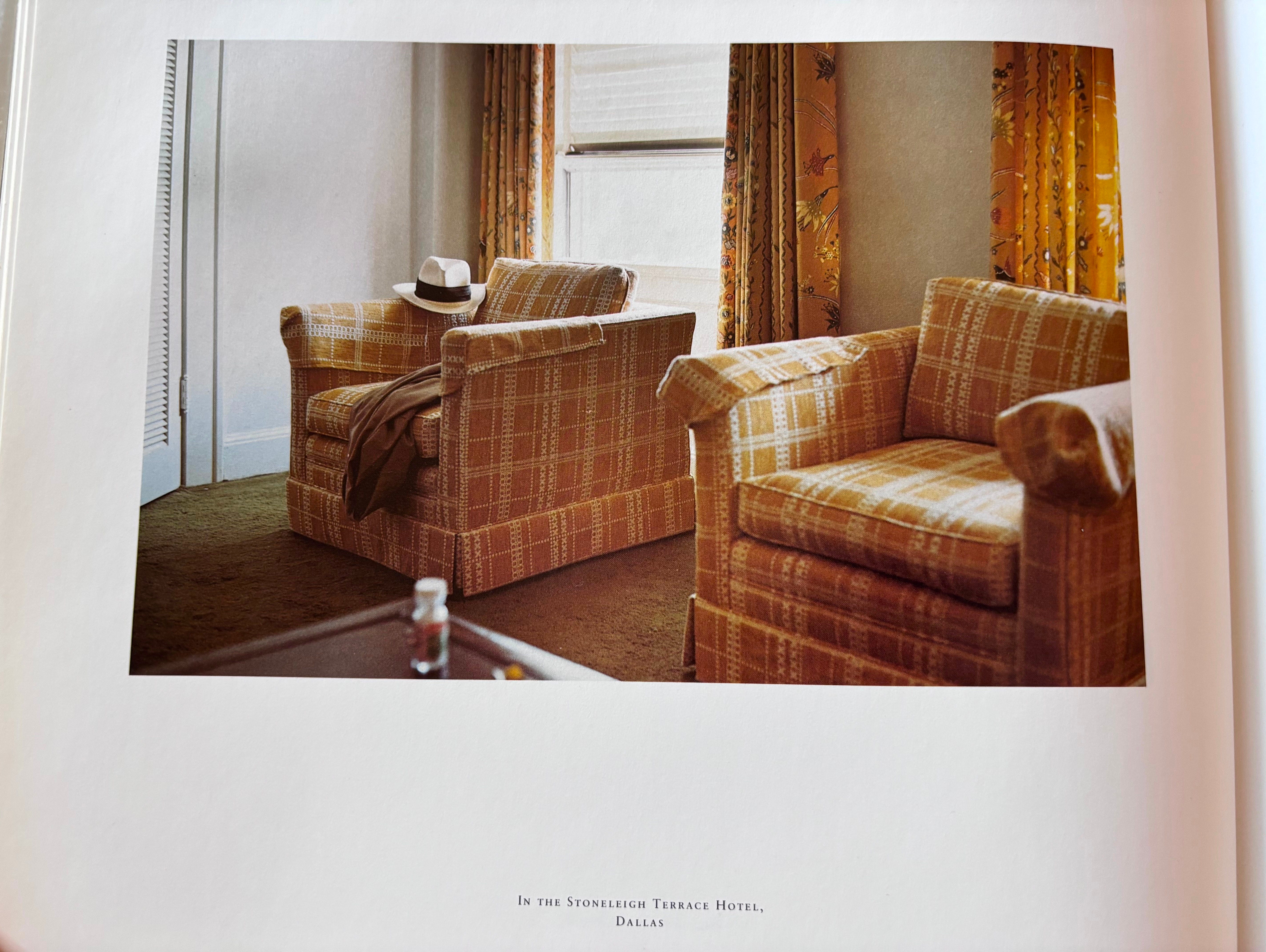
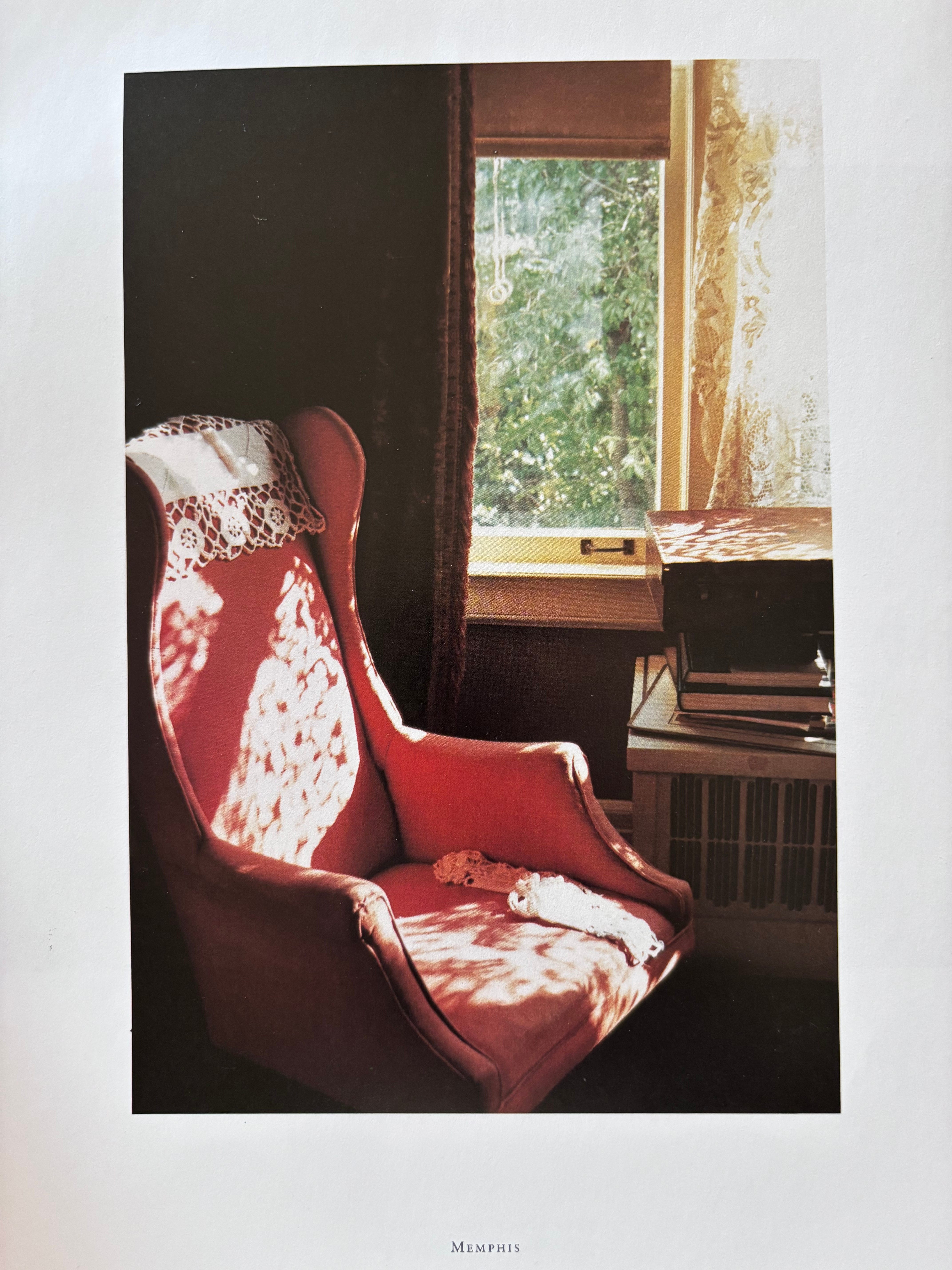
The beauty of interiors is that they appear everywhere in art and culture - paintings, films, photography. I love to find inspiration outside of traditional resources, and I suspected that William Eggleston’s gothic South might include my desired window treatment silhouette. (I will absolutely be returning to this book when I’m ready to deep dive on candlesticks.)
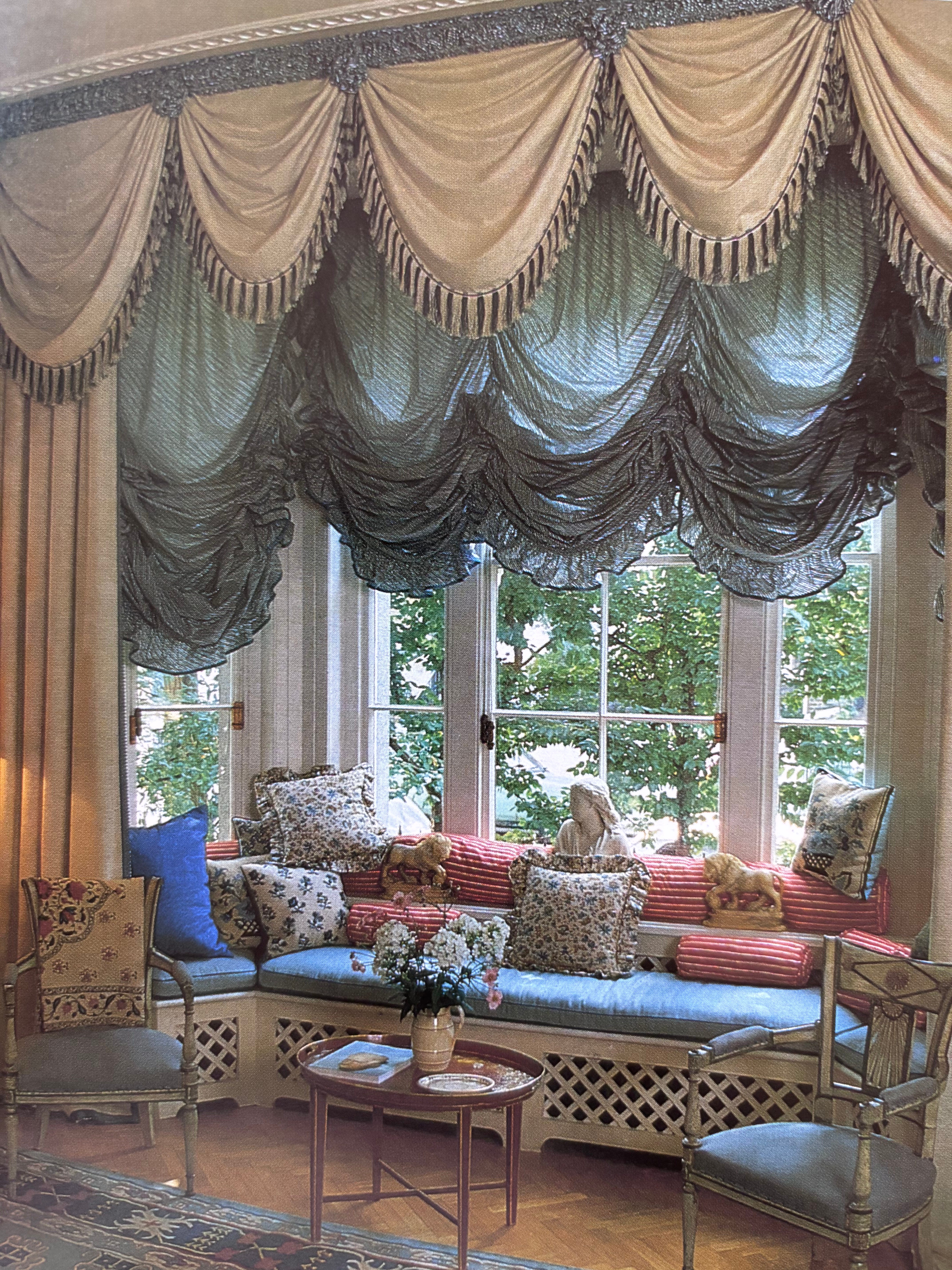
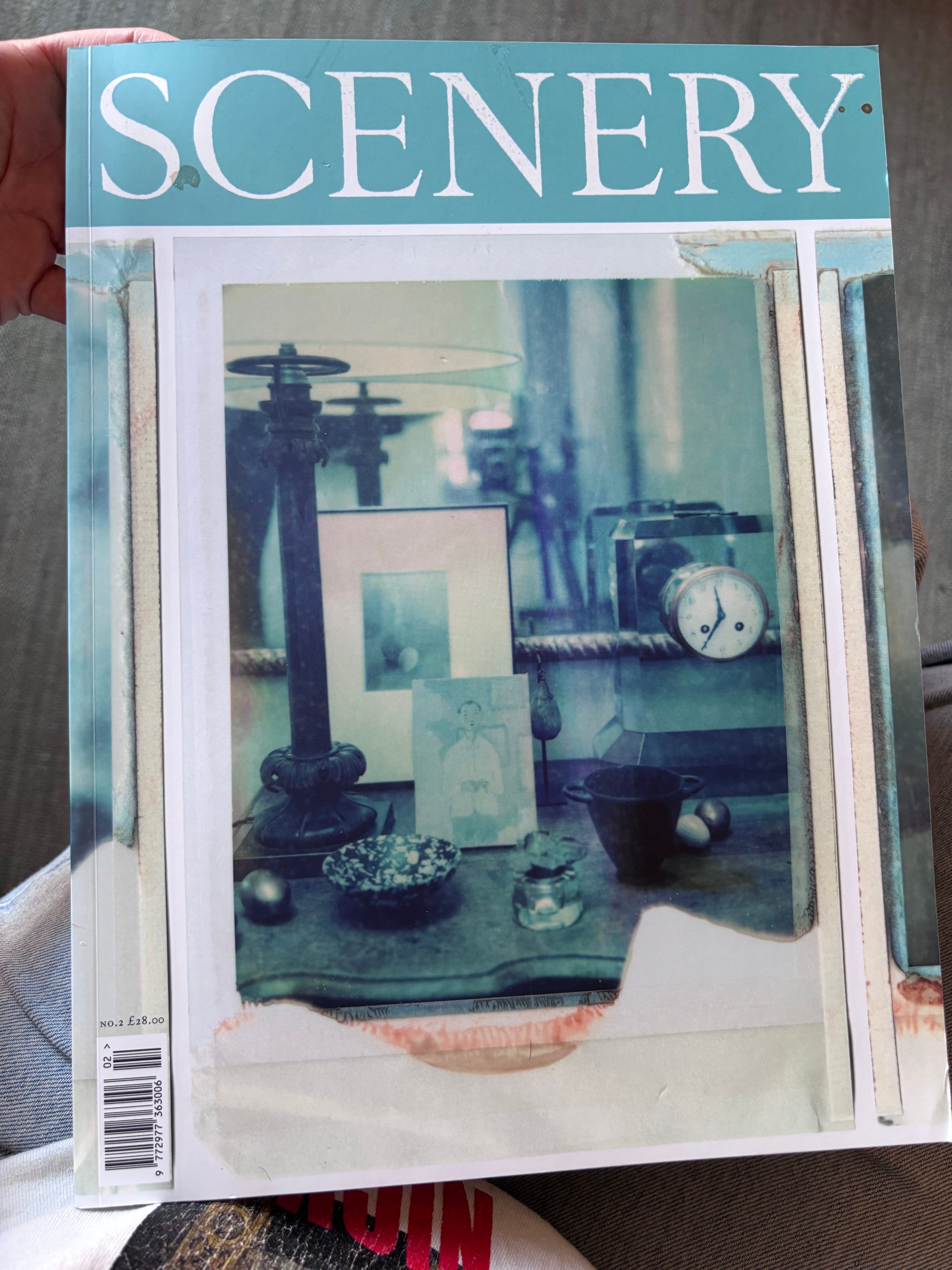
Next I turned to the new-ish Scenery, which is probably my favorite of the latest interior print periodicals. This is from the second issue (Number Two). This magazine is a visual feast - very photo heavy, it has a great mix of historical interiors, contemporary eccentricity, interesting artists and makers, and detail shots to beat the band. It feels related to The World of Interiors in its celebration of the un-polished, which is so needed. I found more lacy sheer inspiration within.
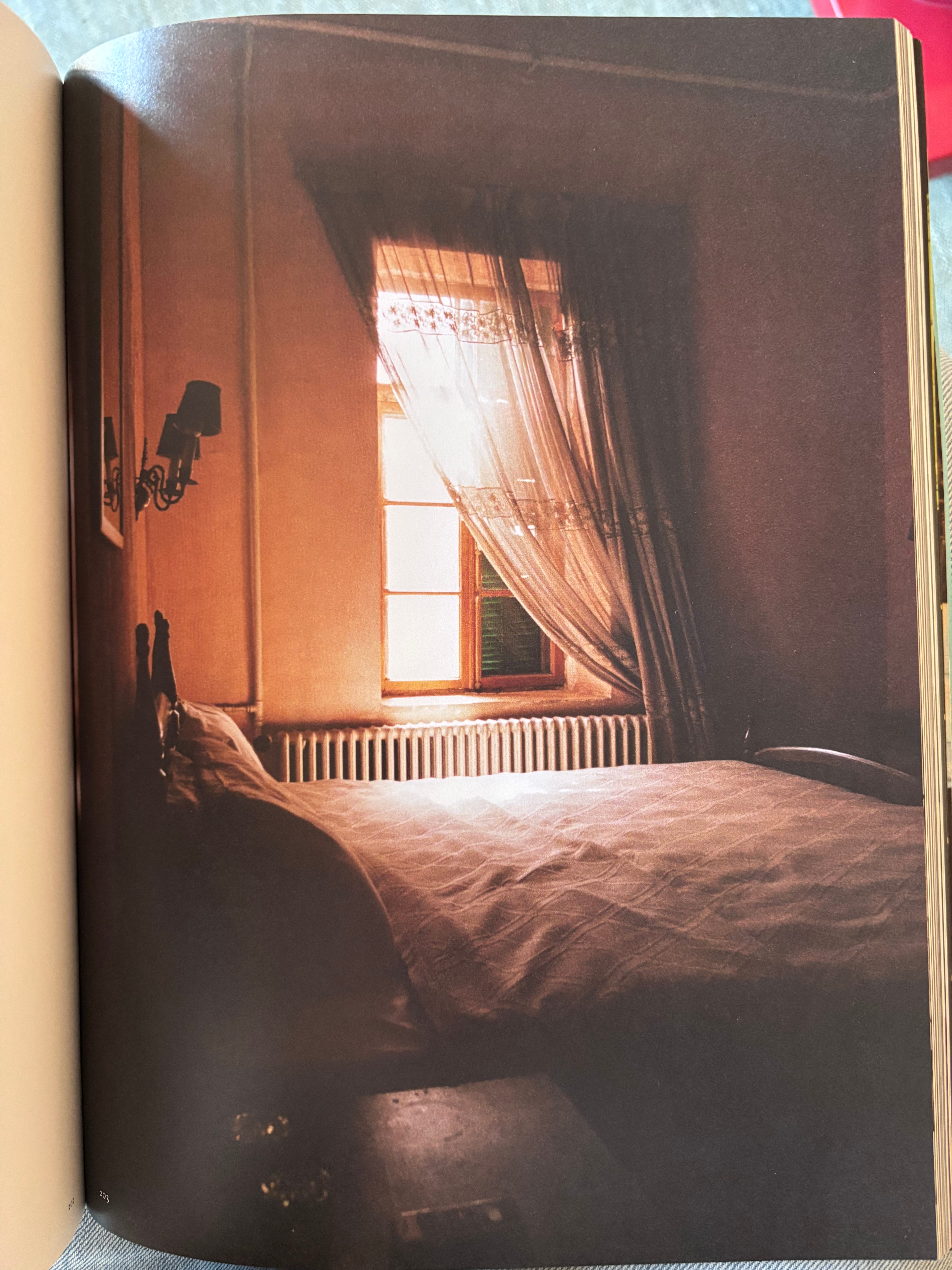
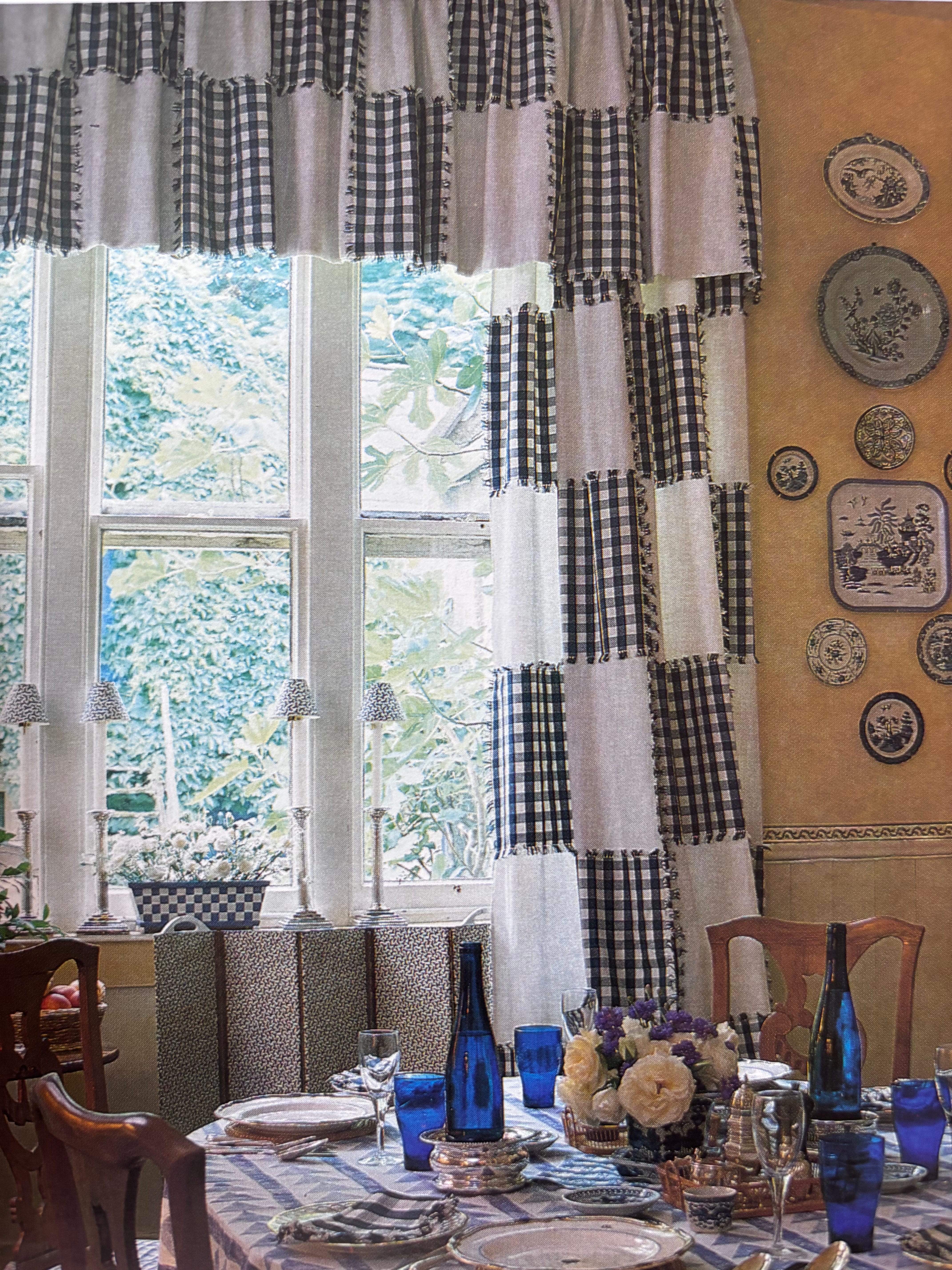
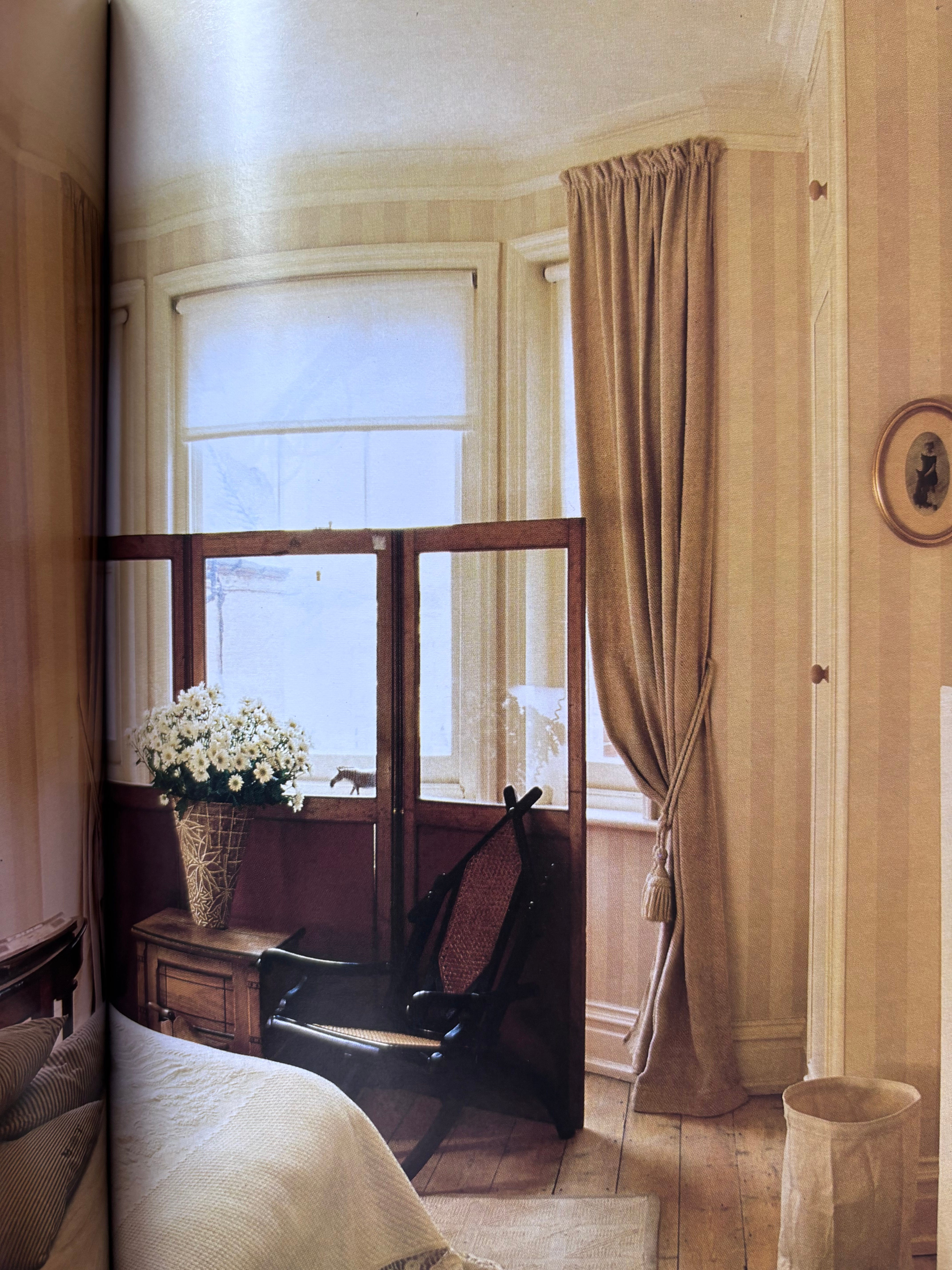
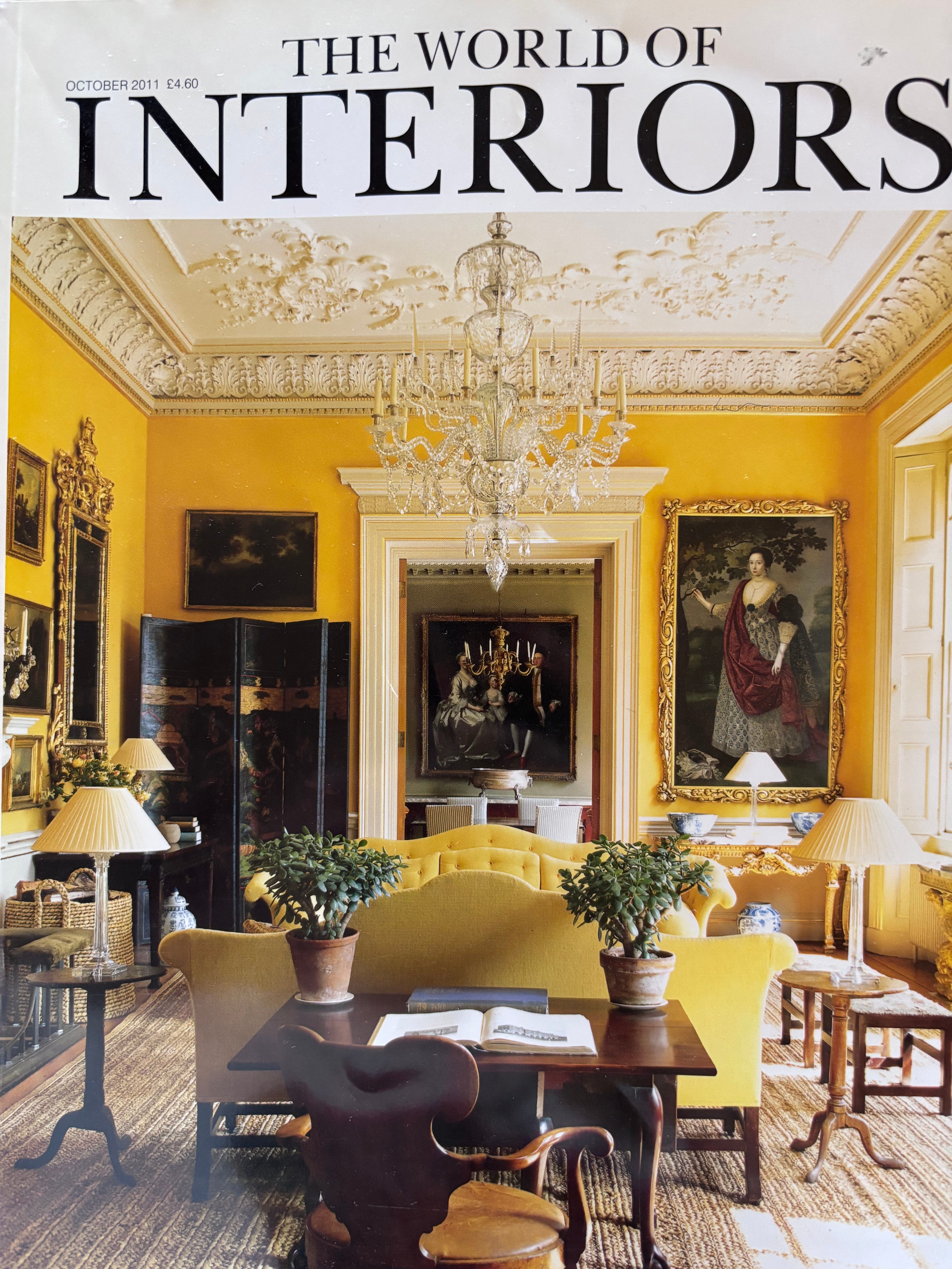
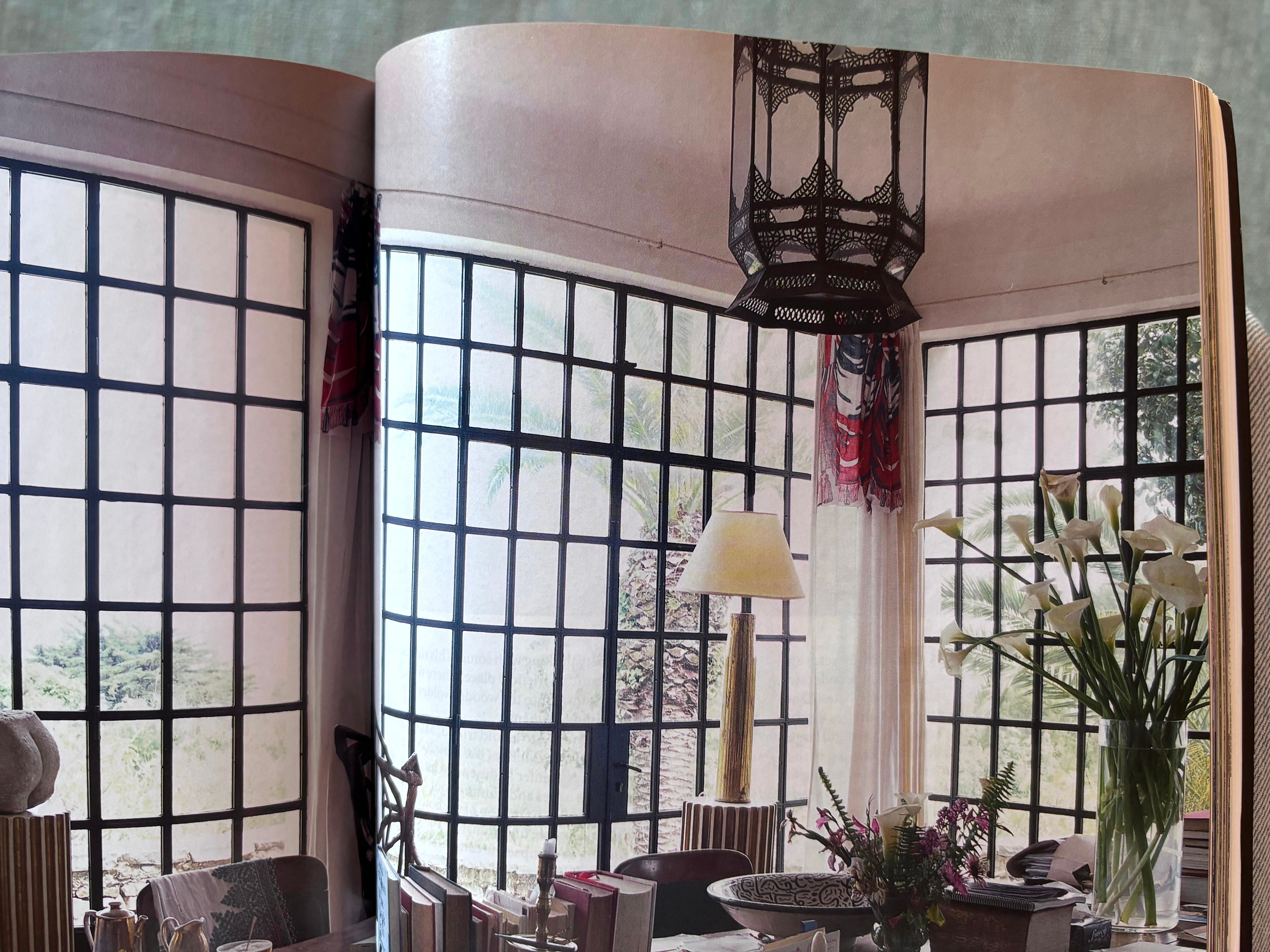
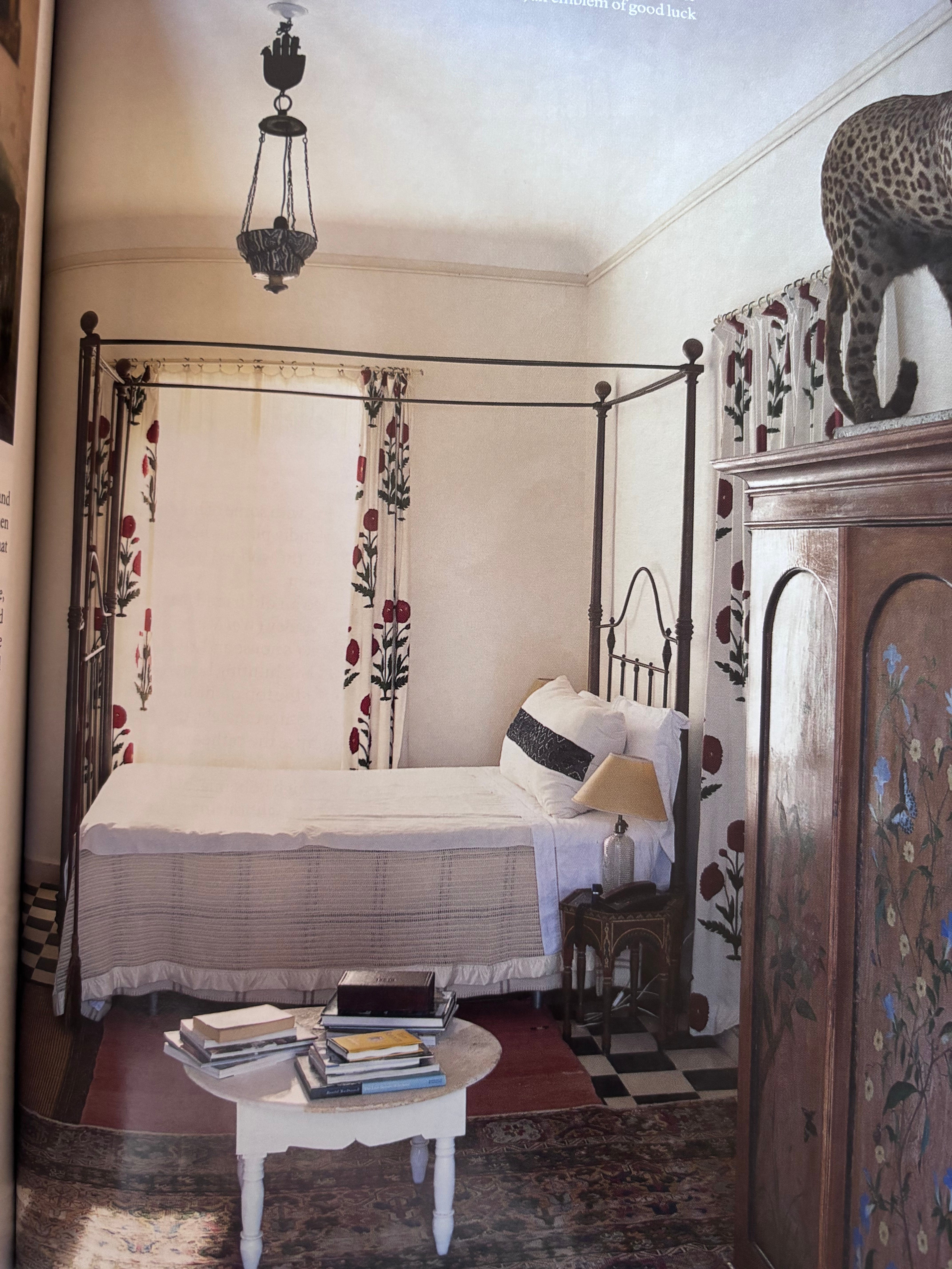
The October 2011 issue of The World of Interiors offers another instance of the understated grandeur coupled with a lived-in ease that can particularly be found in Mediterranean climates. The Tangier home of antique dealer Christopher Gibbs as photographed by Simon Sykes was rich with examples of how to string up a proper cloth.
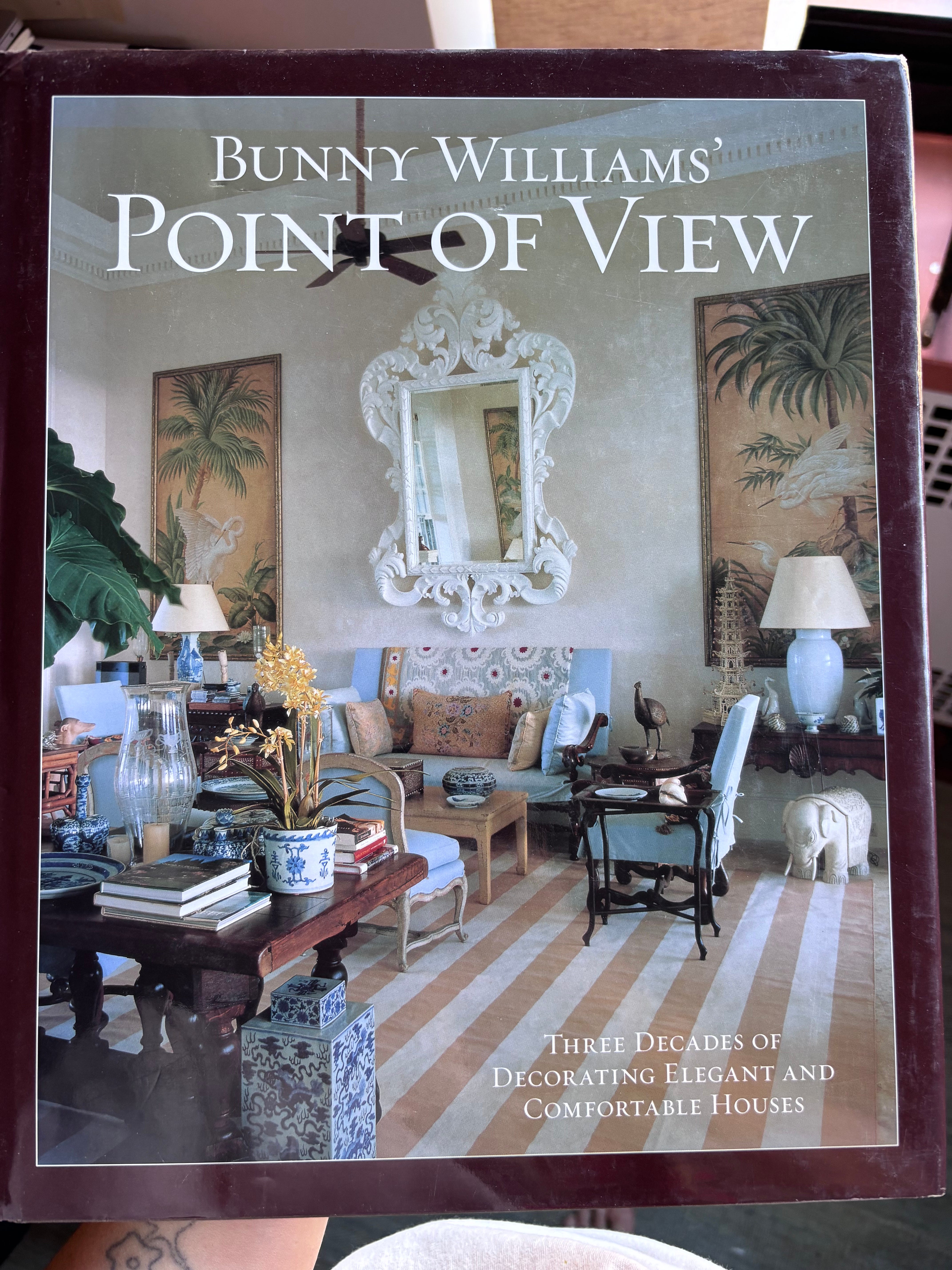
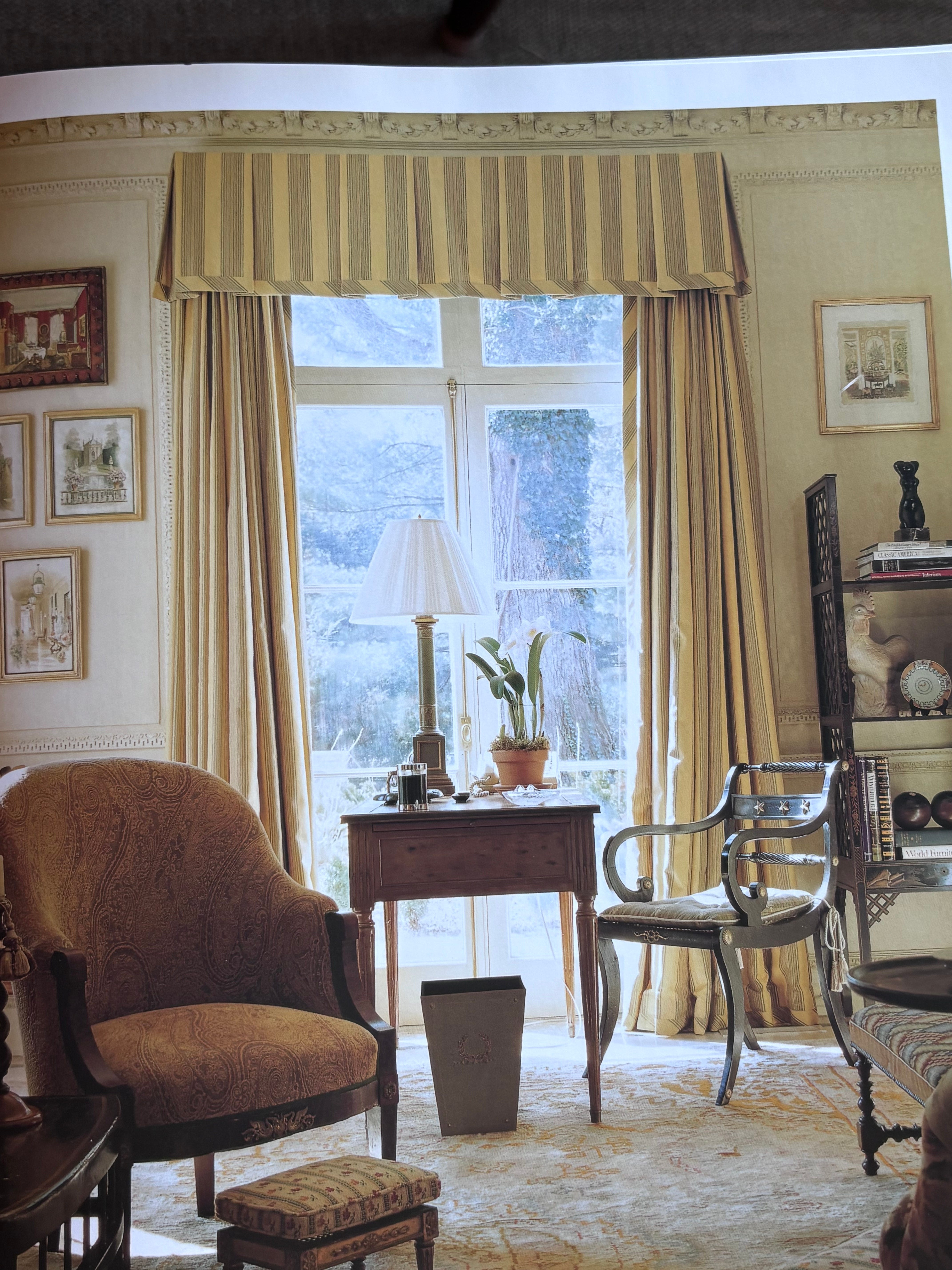
Before I got too far down a bohème rabbit hole, I needed to re-ground myself in classic American décor. I turned to Bunny WIlliams, thee grande dame of this class.
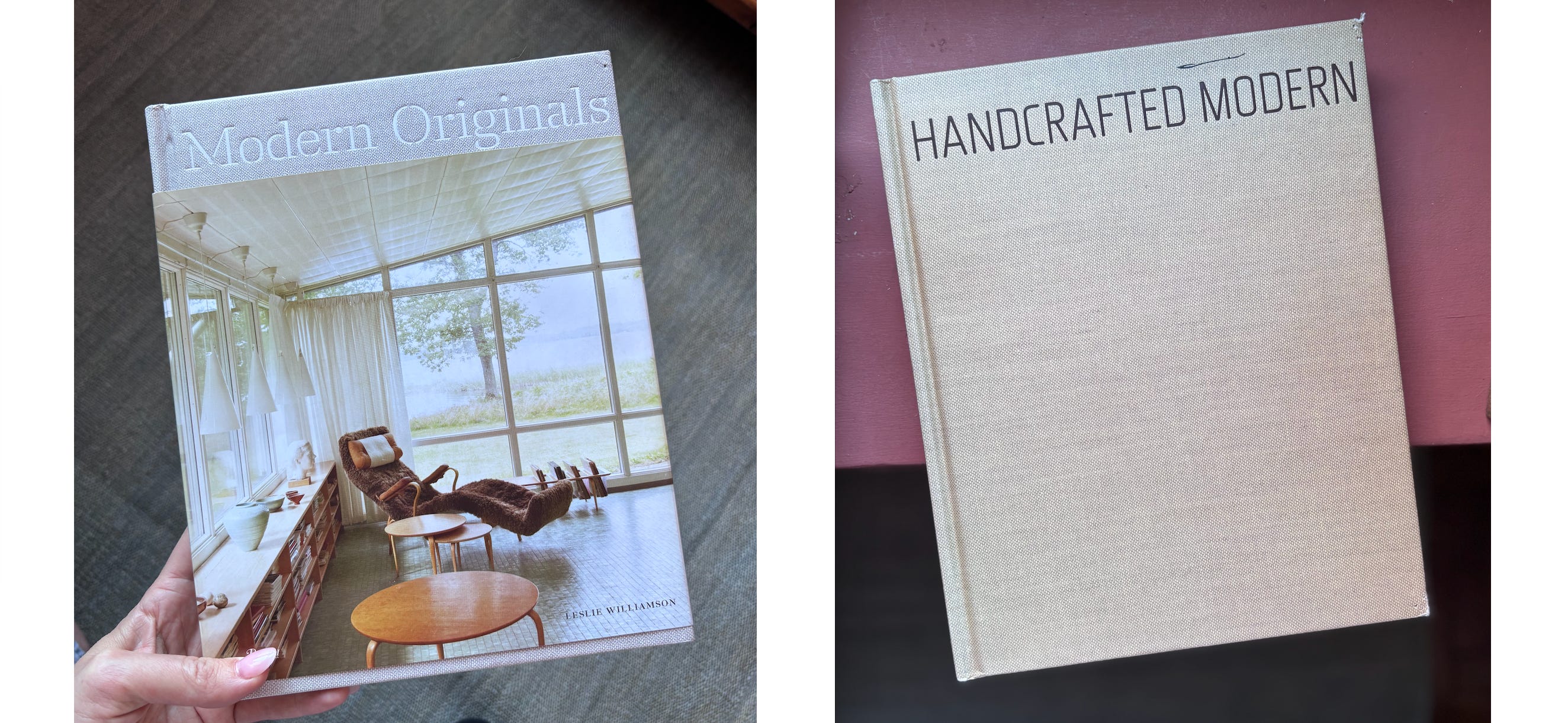
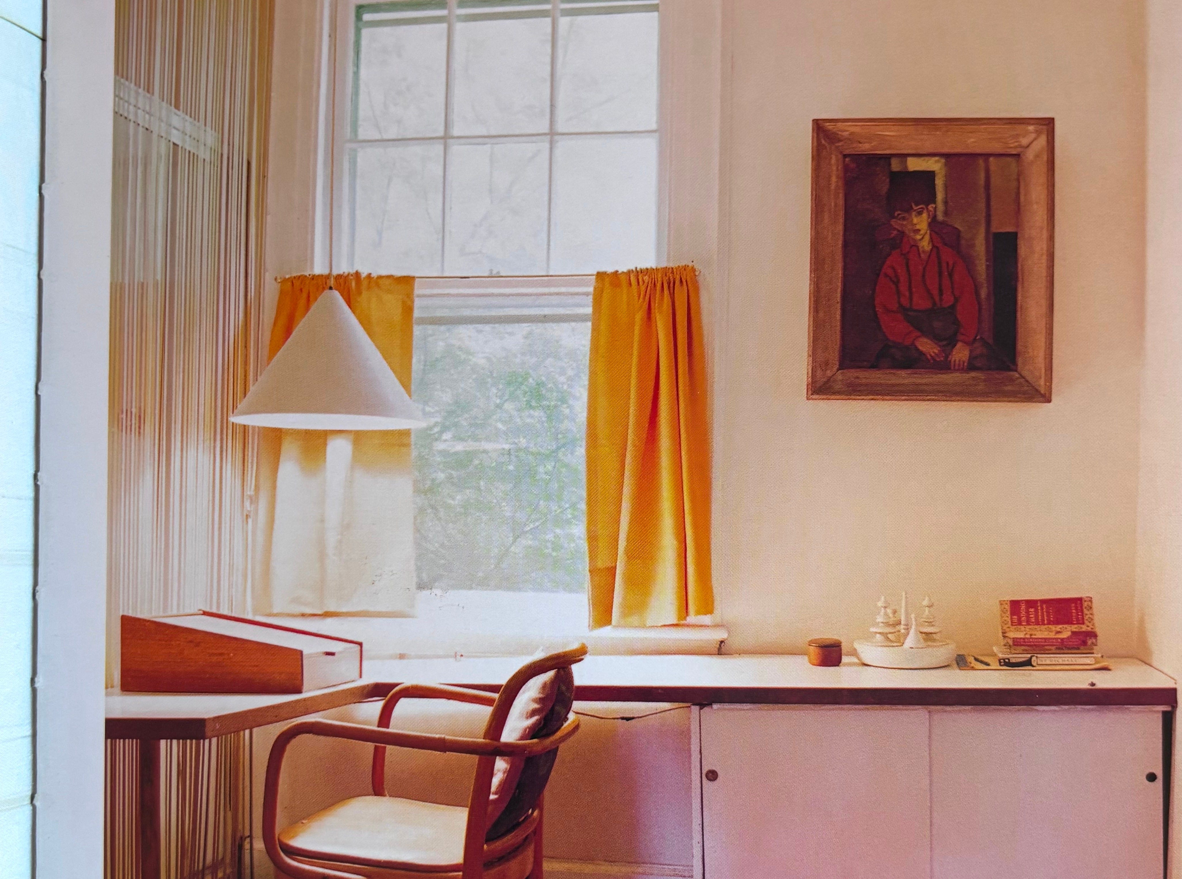
For a bit of a 180 I pulled my well loved Leslie Williamson books off the shelf. Williamson is a gorgeous photographer of interiors whose two books lovingly document the homes of some seriously iconic mid-century designers and architects. These books put to rest the notion of modernism as cold or rigid. The introduction of Handcrafted Modern begins, “Perfection is supremely uninteresting to me.” Amen. I highly recommend having these books in your library, and more of them can be seen on Williamson’s website here.
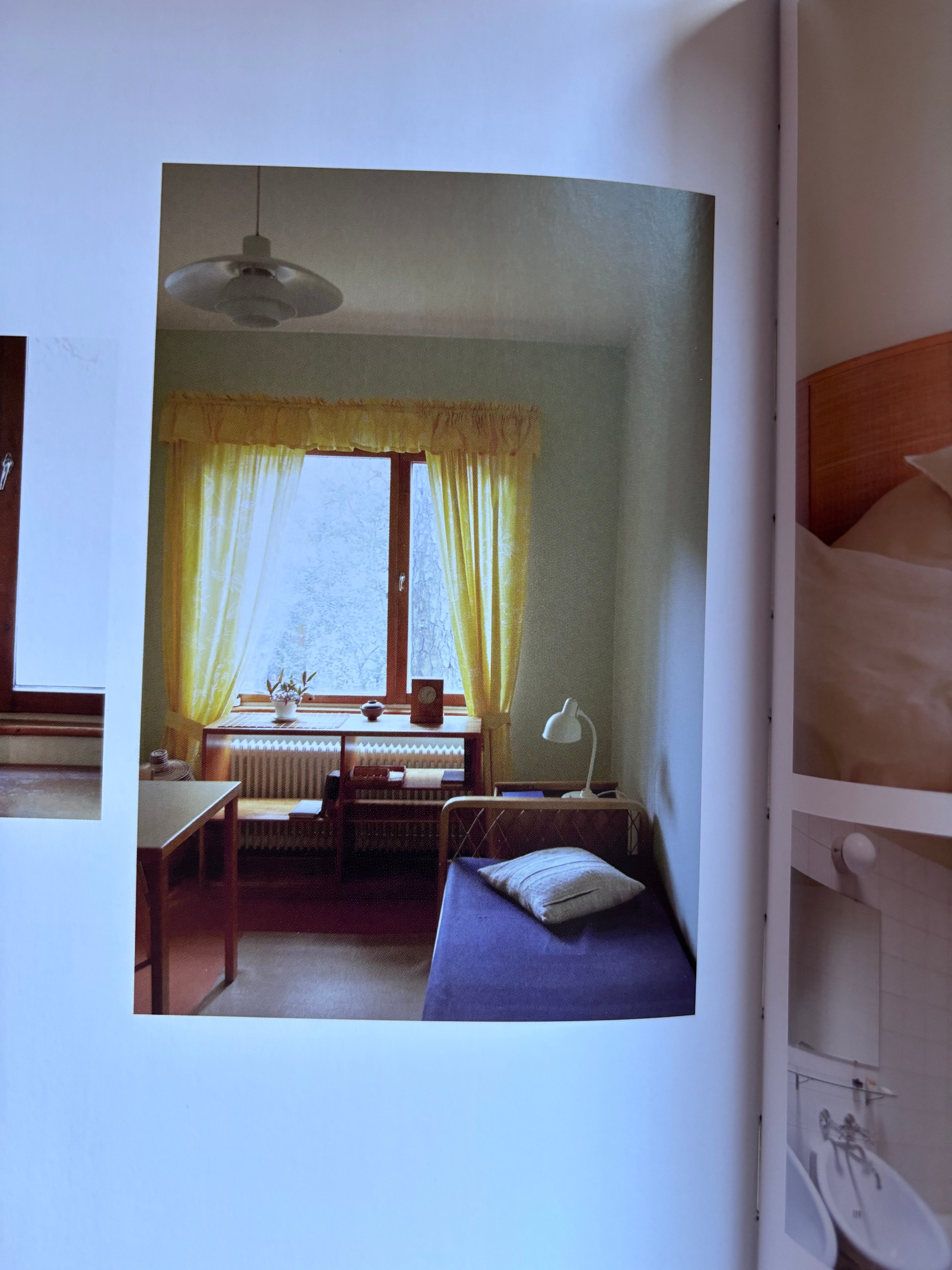
To be honest, I didn’t expect to find my precedent image here. I expected the window treatments within to recede, and many do. But when I landed on Irving Harper’s Rye, New York home, I was struck. (Wright had an exhibit of Harper’s paper sculptures in 2016. I have the catalog from that show, and while there are no window treatments, Harper’s work is mind boggling and delightful.)
I couldn’t be more surprised by where I landed with this exploration. The café curtain poses some new challenges - the hardware, for example. And I’m not totally ready to concede my love of valance. Maybe it’s a café curtain with a matching box pleated valance above, and in a great print like the Le Manach it would have an unexpected décoritivo quality I seek, while letting the light shine in unfettered. Ultimately you have to design for the space at hand, and I think I’ve been stuck wanting something that doesn’t quite suit the space and the life I live within.
Thank you for reading, and I hope you tune in for part 2 (when budget allows).